Brand guidelines. orderbird CD.
A breakdown of orderbird’s corporate design, with guidelines on how to use it—as well as how not to.
Our Logos

orderbird is is the branded house that consists of two POS products, orderbird PRO and orderbird MINI, as well our back end ecosystem, MY orderbird.
Check out our brand architecture here:
Branded House
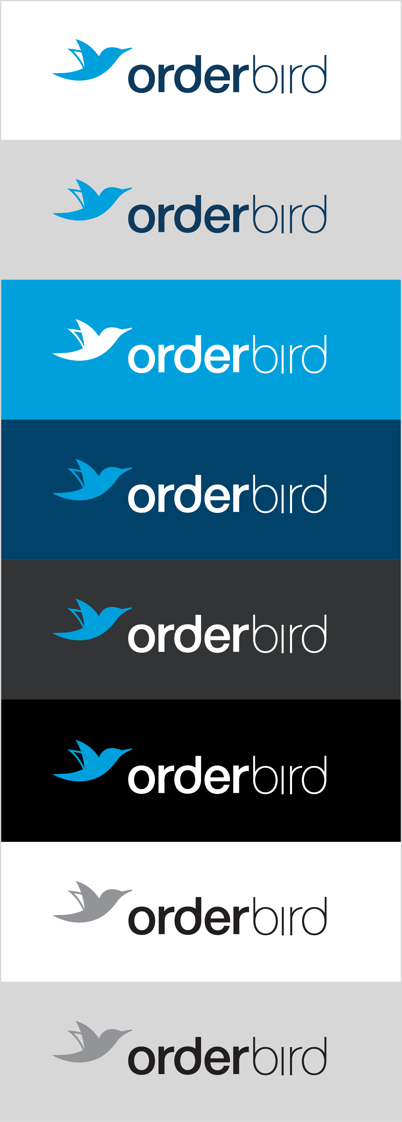
The orderbird logo is a lockup of a logomark and wordmark.
The wordmark is based on the typeface Helvetica Neue. The letterforms have been adapted and optically adjusted. Adaptations to the letterforms emphasise a repetition of circles and vertical lines. The focus on these base shapes embodies orderbird’s principle of simplicity. The use of Helvetica Neue is a sweet, symbolic nod to Apples influence in the founding of orderbird.
The logo's colours are the primary brand colours, orderbird Blue and orderbird Dark Blue.
When writing ordebird in copy, the 'o' should never be capitalised.

Clear Space
When using the logo, please make sure there is sufficient clear space around the logo. Minimum clear space is calculated using the x-height of the text in the wordmark.

The Claim
The only exception to the clear space is when using the logo with the claim. This is how to layout the logo-claim lockup

Minimum Size
For print don’t scale the logo smaller than 20 mm in width. When using the logo with the claim, don’t use sizes smaller than 60 mm in width.
For screens don’t scale the logo smaller than 114 px in width. When using the logo with the claim don’t use sizes smaller than 300 px in width.


Colour Variations
There are four acceptable colour variations of the orderbird logo.
The main logo is used on white backgrounds.
The inverted logo is used on a background of orderbird Dark Blue.
The all-white logo can be used on mid and dark backgrounds or, in rare instances over an image. Check the misuse examples.
The greyscale logo should only be used when print specifications are such that there is no other option.

orderbird PRO
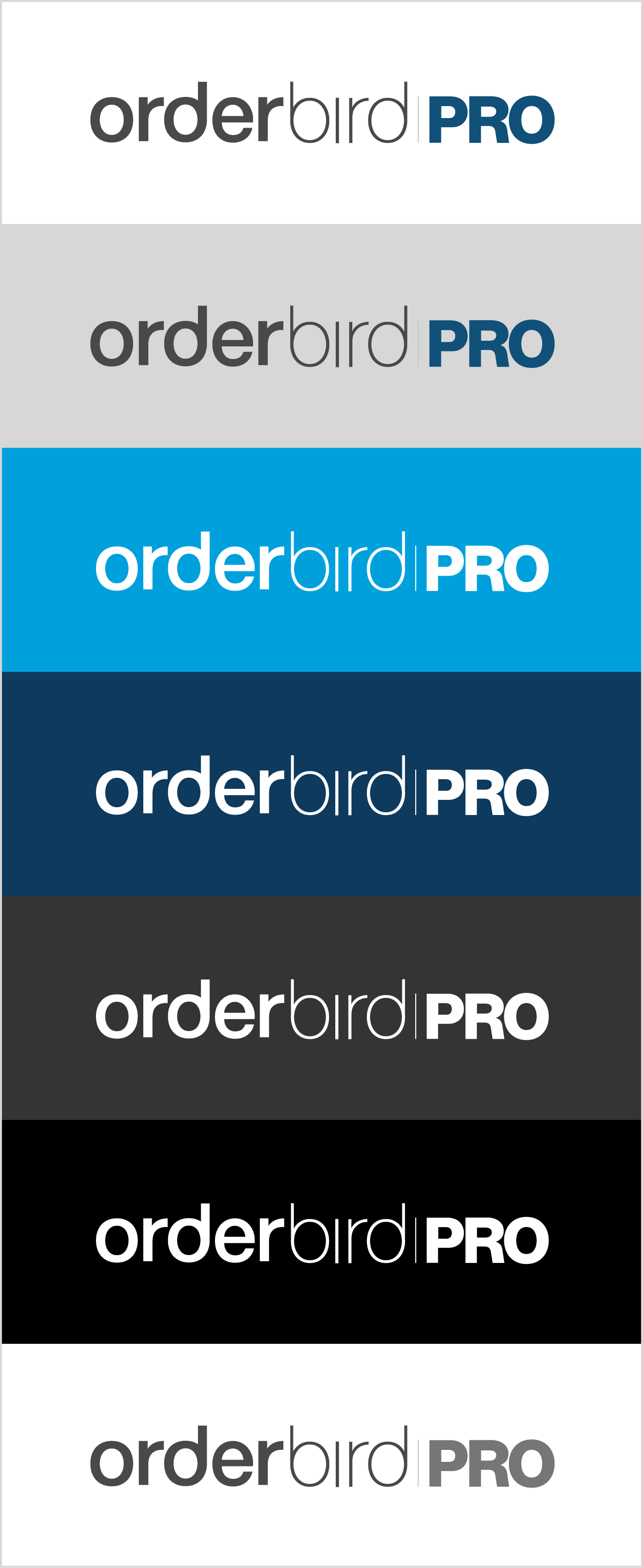
The orderbird PRO logo is the word mark—all lower case—followed by 'PRO'—bold all-caps.
The logo's colours are the brand colours, coal grey, and orderbird Dark Blue.
When writing orderbird PRO in copy, 'PRO' should be set in all-caps and the 'o' of 'orderbird' should never be capitalised.

Clear Space
When using the logo, please make sure there is sufficient clear space around the logo. Minimum clear space is calculated using the x-height of the text in the wordmark.

Minimum Size
For print don’t scale the logo smaller than 20 mm in width. When using the logo with the claim, don’t use sizes smaller than 60 mm in width.
For screens don’t scale the logo smaller than 114 px in width. When using the logo with the claim don’t use sizes smaller than 300 px in width.

Colour Variations
There are three acceptable colour variations of the orderbird PRO logo:
The main logo is used on white backgrounds.
The all-white logo can be used on mid and dark backgrounds or, in rare instances over an image. Check the misuse examples.
The greyscale logo should only be used when print specifications are such that there is no other option.

orderbird MINI
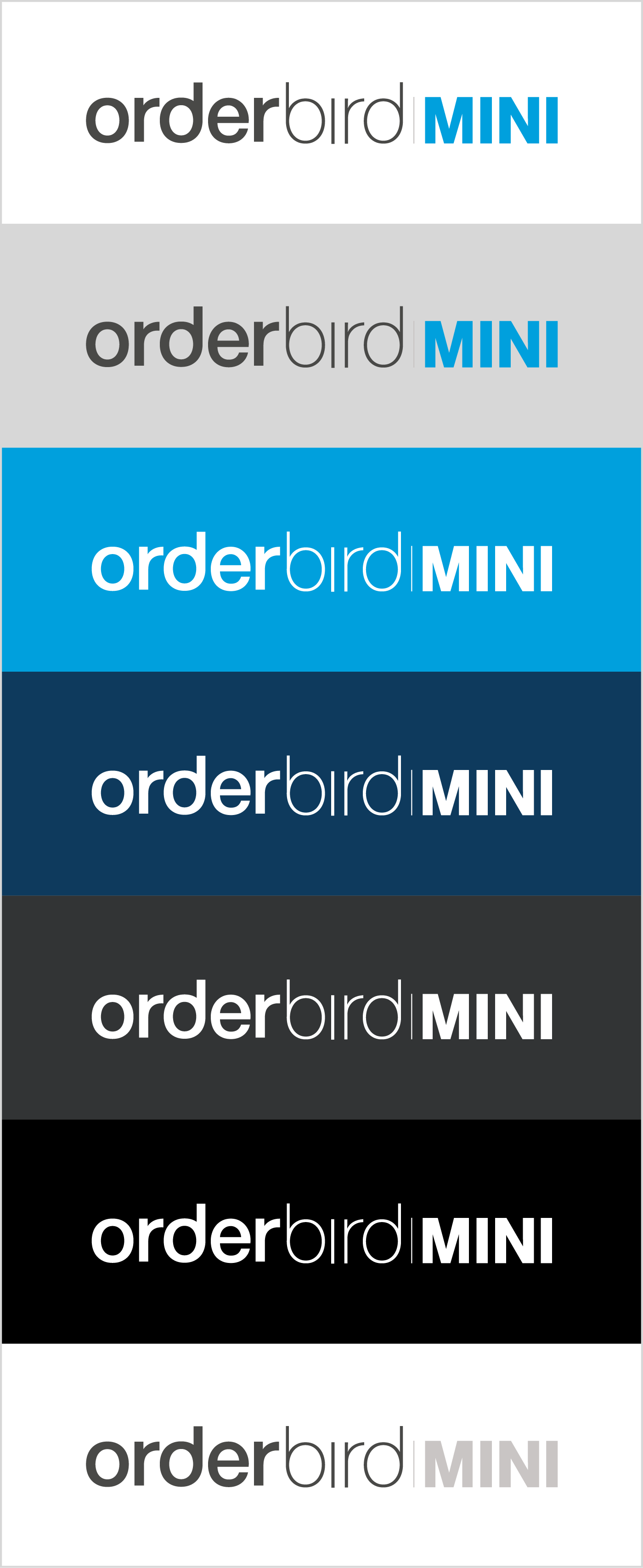
The orderbird MINI logo is the word mark—all lower case—followed by 'MINI'—bold all-caps.
The logo's colours are the brand colours, coal grey, and orderbird Blue.
When writing orderbird MINI in copy, 'MINI' should be set in all-caps and the 'o' of 'orderbird' should never be capitalised.

Clear Space
When using the logo, please make sure there is sufficient clear space around the logo. Minimum clear space is calculated using the x-height of the text in the wordmark.

Minimum Size
For print don’t scale the logo smaller than 20 mm in width. When using the logo with the claim, don’t use sizes smaller than 60 mm in width.
For screens don’t scale the logo smaller than 114 px in width. When using the logo with the claim don’t use sizes smaller than 300 px in width.

Colour Variations
There are three acceptable colour variations of the orderbird MINI logo:
The main logo is used on white backgrounds.
The all-white logo can be used on mid and dark backgrounds or, in rare instances over an image. Check the misuse examples.
The greyscale logo should only be used when print specifications are such that there is no other option.


MY orderbird
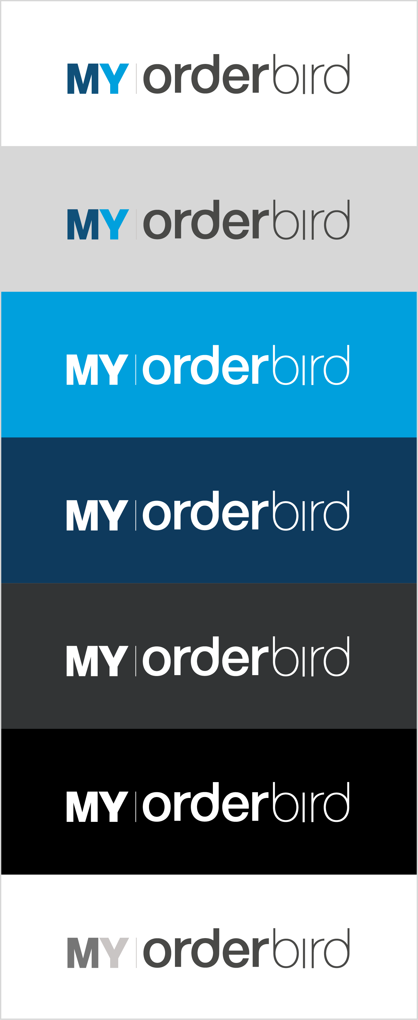
The MY ordebrird logo is the word MY—bold all-caps—followed by the orderbird wordmark.
The logo's colours are the brand colours, orderbird Blue, orderbird Dark Blue and coal grey.
The bi-color setup of the word MY referrs to our two POS products orderbrid PRO (Dark Blue) and orderbird MINI (Blue).
When writing the name 'MY orderbird', MY should be written in all-caps and the 'o' from orderbird should never be capitalised.
Clear Space
When using the logo, please make sure there is sufficient clear space around the logo. Minimum clear space is calculated using the x-height of the text in the wordmark.

Minimum Size
For print don’t scale the logo smaller than 20 mm in width. When using the logo with the claim, don’t use sizes smaller than 60 mm in width.
For screens don’t scale the logo smaller than 114 px in width. When using the logo with the claim don’t use sizes smaller than 300 px in width.

Colour Variations
There are three acceptable colour variations of the MY orderbird logo:
The main logo is used on white backgrounds.
The white logo can be used on mid and dark backgrounds.
The greyscale logo should only be used when print specifications are such that there is no other option.

Co branding
If showing one of the orderbird brand house's logos alongside another brand please be sure to respect the clear space around the logo.
Logos should be separated by a thin coal grey line as shown in the examples.

Our Typography

Neue Haas Grotesk
This is the main typeface and is used 99 % of the time.
Helvetica Neue comes with a lot of styles.
The type sample shows only the recommended styles.
- Please don’t mix too many styles.
- Only use italic settings if it’s
absolutely necessary. - Never use bold or heavy italics.
- If you’re mixing type-weights make sure that there is sufficient contrast.
Do not use condensed typesetting. Don’t mess with the kerning or tracking without due care and never scale the type horizontally or vertically.

Sign Painter
This is a display typeface. It should be used sparingly and only when appropriate.
It is a less serious typeface than Neue Haas Grotesk and is therefore used when a lighter tonality is suitable.
Sign Painter is also much harder to read than Helvetica Neue. Never use it for long texts—anything longer than five words is too many. Never use it at a small point size.

Helvetica Neue
Neue Haas Grotesk is a typeface derived from Helvetica Neue. In the case that you are not able to use Neue Haas Grotesk please take Helvetica Neue as a fallback option.
The most prominent case for this is while using the google docs/slides ect.
Our Colours

Core Colours
The main brand colours are those used in the logo: orderbird Blue and orderbird Dark Blue.
orderbird Blue
HEX #00A3E0
RGB 0-163-224
CMYK 86-8-0-0
Pantone C 299 C
Pantone U 299 U
orderbird Dark Blue
HEX #01426A
RGB 1-66-106
CMYK 100-57-9-52
Pantone C 2955 C
Pantone U 2945 U
Secondary Colours
There is also a secondary colour set consisting of highlight yellow and a grey tone spectrum.
Highlight Yellow
HEX #FECC00
RGB 254-204-0
CMYK 0-20-100-0
Pantone C 116 C
Pantone U 115 U
White
HEX #FFFFFF
RGB 255-255-255
CMYK 0-0-0-0
Pantone C P 1-1 C
Pantone U P 1-1 U
Light Grey
HEX #F8F8F8
RGB 244-244-244
CMYK 5-4-4-0
Pantone C P 179-1 C
Pantone U P 179-1 U
Mid Grey
HEX #BDBCBC
RGB 189-188-188
CMYK 0-0-0-35
Pantone C Cool Grey 4 C
Pantone U Cool Grey 4 U
Coal Grey
HEX #323435
RGB 50-52-53
CMYK 0-0-0-90
Pantone C P 179-15 C
Pantone U Black 6 U